Google Ad Landing Pages Versus Normal Website Pages
A medical clinic I work with is about to start Google Ads for skin checks. Their first question was a fair one: do we need a separate landing page, or can we send the ads to the skin check page we already have?
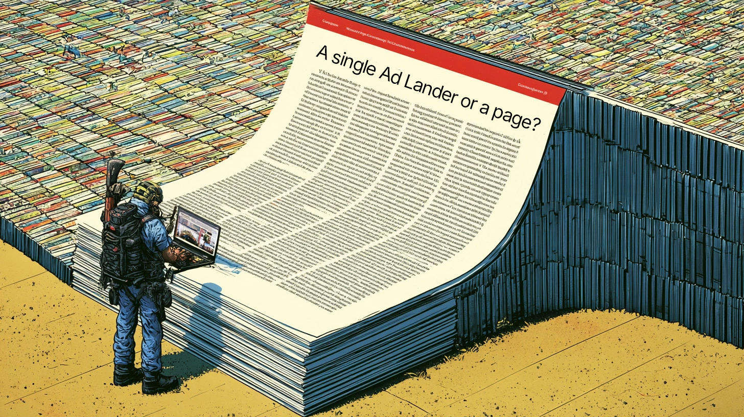
The short answer is that you can use the page you have. It will need some work first, though. A good website page and a good ad landing page want slightly different things, but one page can do both jobs if you build it as a hybrid.
Think of it like a shopfront. The window display is the landing page. It has to tell someone walking past what’s inside, what it costs and how to get in, in about three seconds. The shop behind it is the website page, with depth, detail and room to browse. You don’t need a second shop. You need a better window.
The short version
If you’re about to point Google Ads at an existing page, check these first:
- The first screen answers the search. Someone who searched “skin check near me” should see skin checks, the price, the location and a Book button without scrolling.
- The price is on the page. If people have to hunt for it, many will go back to Google and click the next ad. You’ve paid for that click.
- There’s one main action. A Book button and a tap-to-call button, side by side. Not five competing links.
- Nothing sends people away. No buttons that open another website in the top half of the page.
- Every claim can be checked. Credentials, equipment and services, not “the best” or “leading”.
- Bookings and calls are tracked. If you can’t count the bookings, you can’t tell whether the ads are working.
- Your keyword list has been cleaned up. Searches you don’t want to pay for are blocked before the campaign starts, not after the budget has gone.
Do you need a separate landing page?
Usually not. A traditional landing page is a stripped-back page built only for ads. It has no menu, it’s often hidden from Google search, and it has one job. That works well for big advertisers who test page versions against each other every week. For most small businesses it creates more problems than it solves.
- Two pages about the same thing compete with each other. If your skin check page and a separate “Skin Check Perth” page are both visible to Google, they split your search rankings between them.
- Somebody has to keep both up to date. When prices or hours change, a forgotten landing page keeps advertising last year’s fee. On a busy clinic’s site, that page is usually the one nobody remembers.
- The ad-only page earns no SEO. Every improvement you make to it helps the paid clicks and nothing else.
A hybrid page avoids all three. The top of the page works like a landing page: price, hours, location, proof and a Book button. Further down it works like a normal website page, with the detail Google and careful readers want. One page, one set of prices to update, and the work you do for the ads also helps the page rank in normal search.
This was a real debate on the medical website. The clinic liked a “matrix” layout, a grid of service boxes like a menu, which several competitors use on their skin check pages. A grid like that is a good hub for people who are browsing. It’s a poor place to send a paid click from someone who searched for one specific thing. We kept the boxes, moved them further down the page and put an ad-ready top section above them. Both sides got what they wanted.
There are times a separate page is worth it:
- You’re running a time-limited offer that doesn’t belong on the main site.
- You’re spending enough to test two versions of a page against each other.
- The ad is for something the website doesn’t cover at all.
Outside of those, tune up the page you have.
What we changed on the medical website page
The clinic’s skin check page was already a good page. It ranked, it was thorough, and it explained the process well. As an ad landing page it had gaps, and most of them were in the first screen.
1. The price moved to the top
The page had no price at all; it lived on a separate fees page. We added a small box under the main heading showing the cost after the Medicare rebate. Healthcare searchers compare on price as much as anyone else. Showing it up front also means people who only want a free service don’t click through, so the clinic doesn’t pay for them.
2. Saturday hours got their own box
Weekend appointments are a genuine reason to choose one clinic over another. A one-line box beside the price makes that visible without anyone needing to find the contact page.
3. A call button beside the Book button
Plenty of people, older patients especially, would rather ring than book online. The existing Book button got a matching outlined “Call” button next to it, which dials straight from a phone.
4. A strip of facts anyone can check
Under the hero section we added four short points: the doctors’ skin cancer training, dermoscopy at every check, biopsies and excisions done on site, and the full-body photography service. Every one of them is something a patient or a regulator can verify. Health advertising in Australia is regulated, so this matters (more on that below).
5. A clear fees section
Three cards: a standard check, a complex check and full-body photography, each showing the fee and the out-of-pocket cost. A footnote covers pathology and weekend billing. It answers the “how much?” question in one place, so nobody has to email reception to ask.
6. Things we flagged to fix
- A button near the top sent visitors to an outside website’s risk calculator. Useful for patients, but on a paid page it’s an exit door.
- White text on the orange buttons failed accessibility contrast checks. Dark text on the same orange passes easily.
- A couple of phrases elsewhere on the site leaned towards superlatives. They’re harmless on a quiet page, but risky once you’re paying to send traffic there.
None of this was a rebuild. It took about an hour inside the page builder the clinic already uses, and the staff can still edit every part of it themselves.
Google Ads habits that save you money
The landing page is only half the job. While planning this campaign we covered a few things I’d tell any small business before they spend a dollar on ads.
1. Clean the keyword list before launch
I pulled about 140 skin check search terms from Google’s Keyword Planner. A good chunk of them shouldn’t be bid on:
- Other businesses’ names. Several high-volume terms were competitor brand names. People searching for a specific clinic want that clinic, not yours.
- The wrong profession. Searches with “dermatologist” in them were common. A GP clinic can’t honestly advertise to those searches, and the people searching want a specialist anyway.
- Research, not bookings. Terms like “cancer moles on skin” get plenty of searches, but they come from people reading up, not people ready to book.
Those go in as negative keywords, which tell Google never to show your ad for them. One more check: make sure the volumes in Keyword Planner are for your area. If the location was left on “Australia”, a figure like 10,000 searches a month is mostly people interstate.
2. One search intent, one destination
Group keywords by what the person actually wants, and send each group to the page or section that answers it. “Skin check near me” goes to the top of the skin check page. “Medicare skin check” goes straight to the fees section. “Full body skin check” goes to the full-body photography page. The closer the match, the cheaper the click.
3. Understand Quality Score
Google rates every keyword on three things: expected click-through rate, ad relevance and landing page experience. Landing page experience means how relevant and useful the page is to the person who clicked. It’s the one part you fully control, and a better score means you pay less per click for the same position.
4. Track bookings and calls, not just clicks
Clicks cost money; bookings make money. Set up conversion tracking on the Book button and on tap-to-call. If your bookings happen on a third-party platform, it usually won’t report back to Google Ads by itself, so tracking the button click is the practical substitute. Without this, you’re judging the campaign on traffic alone.
5. Follow the rules for your industry
Health services in Australia have strict advertising rules. Under the National Law and Ahpra’s guidelines, health advertising can’t use testimonials about clinical care, can’t be misleading, and can’t use unsupported superlatives. GPs also can’t call themselves “specialists”, because that title is protected. Those rules apply to your ad copy and to the page it links to. Other industries have their own versions, such as licensing claims for trades or financial disclaimers.
6. Get the page live before the ads
It sounds obvious, but campaigns often start while the landing page is still “nearly done”. Every click in that gap costs you money and lands on the old page. Finish the page, check it on a phone, then switch the ads on.
7. Read the search terms report every week
Google shows you the actual searches that triggered your ads. In the first month, check it weekly and add new negatives. This is where most wasted spend gets found, and no amount of upfront planning replaces it.
Transparency up front
Most of what makes a page good for Google Ads also makes it better for everyone else. A price up front, clear hours, an easy way to book and facts instead of fluff help the person who found you in normal search just as much as the one who clicked an ad.
That’s the real benefit of the hybrid approach. The clinic’s page was ready for its January campaign weeks early. Meanwhile the new price and fee content can start helping it show up in normal search for things like “skin check cost” before the ads spend a cent.
If you’re about to start Google Ads, or you’re already running them and the bookings aren’t coming, look at the page before you look at the budget. Usually it just needs a better shop window.
Sources
- About Quality Score for Search campaigns (Google Ads Help)
- Summary of the advertising requirements (Ahpra)